Tuesday, December 7, 2010

Week 15

Ibis

 Craft
This piece was rendered solely in calligraphic ink onto watercolor paper.  The image comes from a photograph taken in the spring of 2009, and was enlarged before tracing paper was used to define the tribal designs.  The design was then transferred, and the application of ink began through the use of quick strokes

Concept
The piece is intended to be a traded artwork, but due to the fact that I was ill on the day that the trade was established, I created a piece that I felt represented my work throughout the year and also kept up with the level of quality that my pieces have maintained throughout the year.
 Composition
 The ibis bird takes up the largest portion of the piece, while still keeping a slightly asymmetrical balance between negative space and the rendered form, by having the open space above the head and back, while also using open space elsewhere to help further define the form of the leg, beak, and wing of the ibis.

Week 14

A Bird from the Hand

 Craft
The model for the image is my classmate, Nykki, who graciously posed for my camera.  The piece is rendered onto watercolor paper in calligraphic, waterproof ink by pen, with the later addition of a watercolor wash.  The photograph was altered with tracing paper into tribal designs and then transferred to the paper, where the ink was applied first.  Upon drying, the piece then had watercolor applied directly onto it in the form of several washes.

Concept
Through this piece, I wanted to have a kind of connection between the pieces of the varying animals, and the single image of the person done prior.  The piece uses both human and bird forms then, and is given just a light touch of color to bridge between images that carry no color and those with  strong colors.

 Composition
 The piece has an asymmetrical balance, with the heavier of the two forms being on the left edge, while the lighter bird is more towards the center of the piece.

Week 13

 Make the Mistakes

Craft
This piece was created on watercolor paper, using calligraphic ink in black.  The design of the tribal was sketched out directly onto the page, and then the ink was applied into the negative space by the use of a thin paintbrush dipped into the ink and applied in strokes.  The text was then applied using a thin pointed calligraphic pen, and then the original pencil lines were erased.

 Concept
 The words within the image were come from one of my habits in art creation- my own hesitation to work in such a method or medium that prevents me from undoing my work in the event of a mistake.  In my own mind, I have always had this thought that art needs to be clean and perfect, which makes it difficult sometimes for me to create pieces that are deliberately meant to be sketchy or untidy.  To work in a medium such as ink, it is hard for me to do so due to the fear in my mind that I will make a mistake, or ink will fall in the wrong spot, or that I would spill my ink in strange circumstances (which actually almost did happen in the making of this piece, but luckily only resulted in black ink getting on an already black sweater and ruining a blue undershirt that i had no particular attachments to).  Yet the words are a kind of reminder to me, that sometimes a mistake could be the best thing to happen to a piece, and which shows that it was created by a person, and not some machine...and it is through accidents that new things can be discovered, such as when I first began this style of art.

Composition
The piece uses the negative space as positive space, by applying the ink in an interesting manner while leaving the actual tribal designs untouched by ink, save the text which wraps to the form of the shapes.  The piece also holds onto an asymmetrical balance.

Week 12

Through the Frame

 Craft
This particular piece is created solely using pen, with the large majority of the design being created through the use of stippling dots.  The original image comes from my own collection from the summer of 2009, and was modified and converted into the tribal design using tracing paper before being transferred over to the final paper.  A single .1 black pen was then used to apply the stippling, creating the designs on the figure through the closeness of the dots in specific areas.  A straight edge was lastly used to accomplish the frame design around the figure. 

Concept
The idea behind this piece stems out from an original issue that had been in my mind for some while, and finally tested at the suggestion of others- if I could create these designs to create animal forms, what is to stop me form being able to apply it successfully to that of human forms?  Therefore, I hunted through my photographs for an image that would be interesting to convert into the tribal designs.

Composition
This piece was meant to have a large section of negative space behind the figure, as the large part of the focus was meant to be on the person's face.  The composition was also meant to be weighted more on a diagonal across the page from the bottom left to top right of the page, and the frame applied as a way of containing the figure, while still allowing it to interact with it as part of it's own world.

Week 11

Lionfish- After Bukovnik

Craft
This particular piece was crafted in watercolor pencil onto watercolor paper.  Taking a photograph taken by myself in the summer of 2010, I used tracing paper on top of the original photograph to plot out the tribal designs.  The image on the tracing paper was then transferred over onto the final paper, and from there the watercolor pencil was applied and then water brushed over it, or copious amounts of water were placed in sections and then while still wet drawn over with the pencil.

Concept
This piece was crafted after the works of Bukovnik, an artist who worked in the creation of watercolor pieces of floral arrangements.  For this piece, I incorporated the colors of one of the works into the piece, and followed after the artist's use of little negative space.  The piece is meant to use strong, vibrant colors of the fish it is based off of, while simultaneously eliminating the largest amount of negative space, while working within the confines of a watercolor-like medium.

Composition
This work is meant to dominate the majority of the space of the paper, while still leaving breathing space between the intertwining tribal designs.  Less of the designs were used in creating the head of the fish, to focus the eye to look away from the cluttered spines of the lion fish's "mane"and towards the bottom right edge of the work.

Sunday, October 31, 2010

Art Institute Tour

Myself in front of the Art Institute


This particular piece was in the Modern Wing, titled "Reminiscence of a Cathedral" by Frantisek Kupka.     The piece is oil paint on canvas, using colors in the range of blues, violets, and reds, with lighter colors contrasting the dark central focus of violet.  In the piece, there is a feel to it that reminds me of the stained glass images that make up the windows of the various churches and the national cathedral, which flank the many rows of pews which I can see being represented by the dark blue forms to both sides of the violet structure.


This piece is a bust cast in bronze by the artist Charles-Henri-Joseph Cordier, titled "Bust of an African Woman."  In this work, the piece comes almost to life with the high level of detail created by the varying textures of the clothes, adornments and hair in contrast to the smooth skin of the woman.  The piece used the varying textures to create the realistic look of the piece, and the expression caught in the piece is rather captivating, almost making the woman appear mysterious and elegant.


"Water Lilies" by Claude Monet, is created on canvas in oils, using the brush and layers of paint to get the impression of the lilies while giving the piece texture which is smooth yet not a straight out gradient.  The piece is composed to draw the eye down through the piece by using the reflections in the water to darken the top of the piece and hi-light the brighter colors of the lilly pads in the foreground of the piece. The piece gives a feeling of tranquility that comes with the simple viewing of flowers on the water.

Art Gallery

Outside of the Zhou B Gallery and Cafe
  
The gallery itself was rather quiet, and not many people were really about in any one place.  This room was the largest, and most of the rest of the site was spread across 5 different floors of thin winding hallways, so you would only occasionally meet other people as you passed.
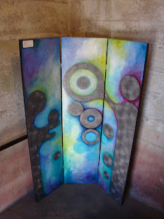
This particular piece was a Mixed media tri-fold panel, given the title "Celebration", unfortunately without the artist's name or contact info on it.  It is a multimedia piece that is made with what appears to be a combination of oil paints, metal, and a kind of clear resin gloss that was used in a large quantity of the works shown by them.  The metal and the paint were most likely layered on alternatively, and then a final coat of the clear resin was applied to the piece as a topcoat.  the piece follows the use of asymmetrical balance, and applies the use of vibrant hues of cool colors in the negative space and gray tones for the shapes which are the main focus for the piece.  In regards to the concept, it almost appeals to me as if the shapes were of people, and that the vivid and almost happy colors alongside of the title  suggest that there is something joyous occurring, indeed worthy of being remembered through "Celebration".


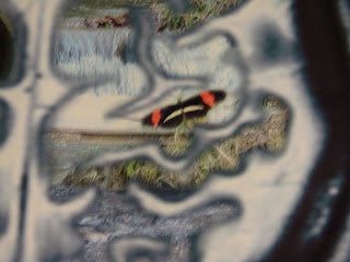
This particular piece comes out of a concentration done by Robin Monique Rios, titled "The Road To..." and worked digitally.  This particular piece follows in the theme that it is created based off of a collective of images, mainly focusing on the use of medical scans, combined with natural images.  In craft, this is a piece which uses the abilities of photoshop to combine together images taken by the artist through a combination of layering, cutting out sections, and varying the opacity of the layers being used.  The use of the natural images inside of the the different lines of the brain used in this piece seemed to suggest to me that on the person's mind is the natural world, perhaps that the brain is drawn to the beauty that is the nature.  In regards to composition, it is a large piece that is meant to draw attention, centered in the frame and using the dark of the negative space to draw the viewer into the details within the brain.  I personally found it amusing that the artist used the same butterfly in their work as the one that I used recently in my own piece, "Butterfly".


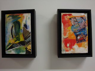
These two pieces were both mixed media collages created by Frances Temchin, and labeled together as "Untitled."  The pieces both appear to be a layering of paint over images that are torn and cut from various sources.  In regards to composition, I enjoy the yellow emphasis placed in the left image and the splash of blue in the right image, which both serve to draw the eye for the pieces they refer to.  In regards to concept, I am unsure of the theme, but they both caught my attention despite both being only about 5 x 7 in size.